Kiss! Nope, this isn’t an order to grab your partner and start smooching. “Kiss” is an abbreviation for a rather blunt advice for all photographers to “Keep it simple, stupid!” This means giving emphasis to your main subject by excluding all other distracting details from the photograph.
Background must not be cluttered with distracting details
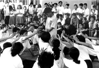 The background mustn’t be cluttered with distractions that compete with the subject for the viewer’s attention (like the spectators and other participants waiting for their turn in the picture above).
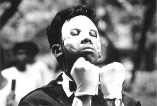
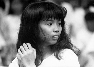
Background blur
Besides looking for the best viewpoint, you can also make use of “background blur” to erase distracting details. By using a big lens opening like f/1.8, f/2, f/2.8 or f/4 (more on this later), you can create a blurred background like in the pictures below.
 Foreground blur
In the same way, you can also create what is known as “foreground blur” as in the picture below.

Bokeh
“Bokeh—from the Japanese ‘boke’, meaning ‘blur’ or ‘haze’—is the blurring or more precisely the aesthetic quality of the blurring of a photograph. Blurring is achieved by using a shallow depth of field. It can be used to create a number of striking light effects or simply to highlight a subject by keeping the rest of an image out of focus.” (From “Bokeh: Using Blur To Your Advantage” by Luke Clum)
Resources on bokeh:
1. How to Obtain Maximum Bokeh; 2. Bokeh for beginners from Nikon USA; 3. Creating Artificial Bokeh in Your Own Home; 4. Beautiful Examples of Bokeh Photography by James Adam; 5. “How To Create Beautiful Bokeh Images”; 6. (More) Beautiful And Captivating Examples of Bokeh Photography by Taimur Asghar
“Bokeh Basics: Take and Make Great Photography with Gavin Hoey”
“Beyond Basic Bokeh: Take and Make Great Photography with Gavin Hoey”
False attachment
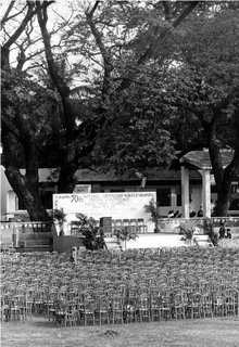
The subject of your photographs can be located in the foreground, middle ground, or in the background. But notice the pictures below. That’s right, there’s no middle ground, only the foreground and the background.
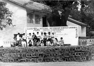
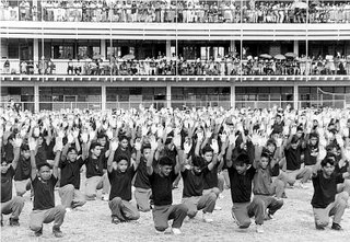
The foreground elements are the chairs (first picture above), and the students performing in the Field Demonstration (second picture). In both pictures, I used a very small aperture (f/16), and a telephoto lens. In the first picture above, the chairs and students on the stage, AND the students in the first row and the building in the background, seem to be attached to one another, or located in just a single plane. (Later on, we will discuss compressed or stacked perspectives, telephoto lenses, etc.)
In reality however, the chairs (first picture) and the students (second picture) were separated from their backgrounds by a distance of nearly 200 feet. If I had used a more frontal viewpoint in both pictures, the effect would have been more pronounced. This illusion is called “false attachment” and is used in those “gimmicky” pictures where somebody seems to be holding in his or her palm another person, or seems to be swallowing that person.
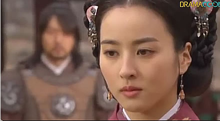
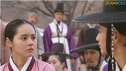
Rack focus (foreground and background blur as used in cinematography)


Foreground interest
Image Magnification and Foreground Interest
Saturday, August 18, 2007
Photojournalism (20): Foreground blur, background blur, bokeh; keep your background simple and uncluttered; false attachment; foreground interest; rack focus
Monday, August 13, 2007
Photojournalism (19): Rule of Thirds explained; the Rule of Thirds versus the Golden Ratio or Fibonacci Spiral; Dynamic Symmetry (hidden geometry of painters) as alternative to Rule of Thirds
| Update as of September 18, 2023:
If you’re a high school or grade school student in the Philippines who’s joining the photojournalism contest in the division, regional, or national press conference, I’m offering two free resources to you : A. 900-plus interactive exercises on English grammar, vocabulary, reading comprehension, verbal analogy, etc (with around 200 megabytes total file size). The exercises have time limit and automatic scoring, with an average of 10 items per exercise. Examples of these interactive exercises are: Common English grammar errors: Exercise 01 (nouns - confusions of number); Phrasal Verbs: Expressions with Go; English Placement Test (45 items). B. 200-plus resources (JPG, PDF, MP4, etc.) on photography and photojournalism, with 600-plus megabytes total file size. For some examples of these resources, surf to the “Free photography e-books, cheat sheets” page. For the download links and more information about how to use the interactive exercises, please surf to my “Better English resources and exercises” blog. Please inform your journalism teacher/schoolpaper adviser or your parents about these resources before downloading them. If you have any question about downloading or using these free resources, please email me (after informing your journalism teacher/schoolpaper adviser or your parents). I’ll be able to reply to you within two to three days; if you don’t see my reply in your Inbox, check your Spam folder. Or, you can text me. Also, if you win in the photojournalism contest at whatever level (district, division, regional, or national), you can send me your prizewinning pictures, and I will feature them in a blog post. Atty. Gerry T. Galacio gtgalacio@yahoo.com 0927-798-3138 |
Note: At the bottom portion of this post, you can watch YouTube videos explaining (1) the Rule of Thirds; (2) the Rule of Thirds versus the Golden Ratio or Fibonacci Spiral; and (3) Dynamic Symmetry (hidden geometry of painters) as an alternative to the Rule of Thirds.
We have been taught from our earliest picture-taking days to center the subject in the viewfinder, with other elements or details placed equally on the left and right sides of the subject.With the picture below for example, my cute niece Chloe and my cute nephew Gino (who looks like me!) are in the center of the frame, with their fluffy dolls on their left and right sides.

(If you are using a 35-mm compact camera, what usually happens is that your subject turns out either on the left or the right side of the picture when you thought you had centered your subject while viewing it through the viewfinder. This is called “parallax error.” With a single lens reflex camera, you don’t have to worry about “parallax error” since what you’ll see through the viewfinder is exactly what the camera lens sees. With the advent of digital cameras where you can see your subject on a LCD panel, parallax error isn’t much of a problem anymore.)
Photography is a relatively young art, having existed for only more than 167 years, compared with painting which has been practiced since the dawn of history. Some people think that painters are better than photographers, or that photography is an art form that’s second class compared to painting. Nothing can be further from the truth. World renowned painters like Miró, Picasso, and Monét were all avid photographers. Toch Arellano, a well-known Filipino photographer who specializes in portraits and yearbook photography, was taking up painting in UST, if I remember right, before he shifted to photography. Vic Sison, a multi-talented Filipino artist, incorporates paintings into his photographs.
Rule of thirds: giving your subject off-center emphasis
If you’d like therefore to excel in photography, you should learn from the techniques of painters. (Portrait photographers oftentimes talk about “Rembrandt lighting.”) One such technique is the so-called “Rule of Thirds.” Following this rule gives your subject or some important element of your image off-center emphasis. You can do this by dividing a scene into a one third/two thirds proportion.
Here’s how:
Step 1: Divide the picture area into three equal parts, both horizontally and vertically. The dividing lines will create four intersecting points, which are called the intersection of thirds.
Step 2: Place your subject (or some important element of your image) at or near any of the intersections.
Take these students in the picture above. I could have centered them in the viewfinder and I would certainly have come up with a good picture. But I purposely placed them at the intersection of thirds to give them off-center emphasis. Placing them at the intersection of thirds gave more emphasis to the boy’s outstretched left hand pointing toward the distance.
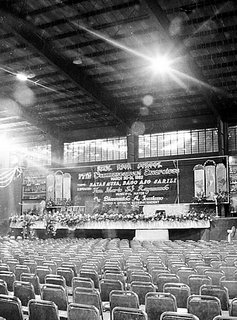 In the picture above of a gymnasium all decorated up for graduation ceremonies, I placed the bright roof light at the intersection of thirds (on the upper right hand corner) to give it off-center emphasis.
The pictures above show another application of the Rule of Thirds. The boys, in the first picture, are on the upper one third of the frame. The stage (second picture) is at the lower one third of the picture while the trees occupy the upper two thirds.
This is exactly how you should shoot the sun. Don’t place the sun in the middle of the frame. Place it either at the upper one third or the lower one third area of the frame.
Golden Ratio or Fibonacci Spiral
Read (1) Why The Golden Ratio Is Better Than The Rule Of Thirds - PetaPixel and (2) Divine Composition With Fibonacci’s Ratio (The Rule of Thirds on Steroids).
The Golden Ratio vs. The Rule of Thirds
Top 10 Composition Tips - Photography Course Pt 3
The Golden Ratio Vs. The Rule of Thirds | The Initiative Pro
Dynamic Symmetry (hidden geometry of painters) as an alternative to the Rule of Thirds
Classically-trained painters often look down on the Rule of Thirds because it uses only horizontal and vertical lines and excludes diagonal lines. Instead, these painters use what is called “dynamic symmetry,” “armature of the 1.5 rectangle,” or “hidden geometry of painters.” As you can watch from the two videos below featuring the photographs of Henri Cartier Bresson, dynamic symmetry can be used in photography. (Bresson is known as the “father of photojournalism.”)
For more information about Dynamic Symmetry, surf to the website “Dynamic Symmetry Art” (topics include “What is Dynamic Symmetry?” and “Dynamic Symmetry for Photographers.”) You can also download the free PDF “The Art of Composition: A Dynamic Symmetry User's Guide for the Modern Artist” (446 pages).
Dynamic Symmetry, Composition and Henri Cartier Bresson - Part 1 of 2
Dynamic Symmetry, Composition and Henri Cartier Bresson - Part 2 of 2
Dynamic Symmetry: Adding Lines to Fit Your Needs [Composition Tips] (2018) by Tavis Leaf Glover
Be a better writer or editor through StyleWriter 4: this software checks 10,000 words in 12 seconds for hundreds of style and English usage issues like wordy and complex sentences, passive voice, nominalization, jargon, clichés, readability, spelling, etc. StyleWriter 4 graphs your style and sentence variety, and identifies your writing habits to give an instant view of your writing. You can learn to adjust your writing style to suit your audience and task. You can learn, for example, the writing style of Newsweek, Time, The Economist, and Scientific American. StyleWriter 4 is widely used in the US federal government (for example, the Environmental Protection Agency). It can be used by educators, students, and professionals in various fields - business, law, social or physical science, medicine, nursing, engineering, public relations, human resources, journalism, accounting, etc. Download your free 14-day trial copy now. |
Subscribe to:
Comments (Atom)


