
| Update as of September 18, 2023:
If you’re a high school or grade school student in the Philippines who’s joining the photojournalism contest in the division, regional, or national press conference, I’m offering two free resources to you : A. 900-plus interactive exercises on English grammar, vocabulary, reading comprehension, verbal analogy, etc (with around 200 megabytes total file size). The exercises have time limit and automatic scoring, with an average of 10 items per exercise. Examples of these interactive exercises are: Common English grammar errors: Exercise 01 (nouns - confusions of number); Phrasal Verbs: Expressions with Go; English Placement Test (45 items). B. 200-plus resources (JPG, PDF, MP4, etc.) on photography and photojournalism, with 600-plus megabytes total file size. For some examples of these resources, surf to the “Free photography e-books, cheat sheets” page. For the download links and more information about how to use the interactive exercises, please surf to my “Better English resources and exercises” blog. Please inform your journalism teacher/schoolpaper adviser or your parents about these resources before downloading them. If you have any question about downloading or using these free resources, please email me (after informing your journalism teacher/schoolpaper adviser or your parents). I’ll be able to reply to you within two to three days; if you don’t see my reply in your Inbox, check your Spam folder. Or, you can text me. Also, if you win in the photojournalism contest at whatever level (district, division, regional, or national), you can send me your prizewinning pictures, and I will feature them in a blog post. Atty. Gerry T. Galacio gtgalacio@yahoo.com 0927-798-3138 |
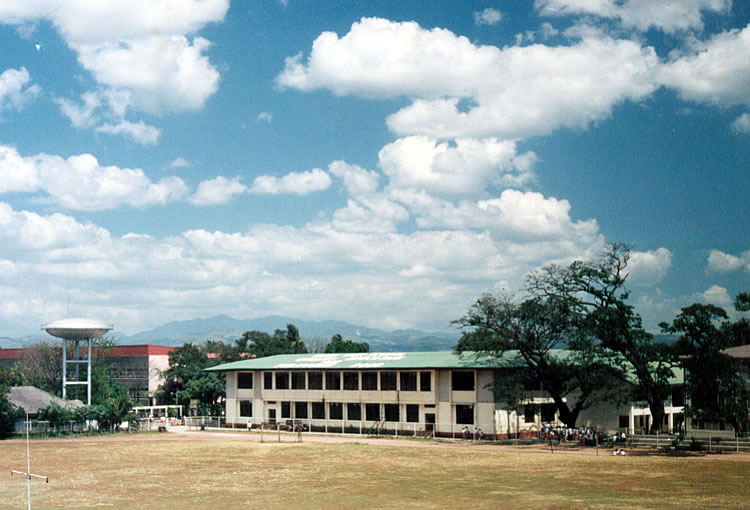
Look at the two pictures below of the athletic oval and Main Building in Rizal High School (Pasig City). One is in black and white, the other in full color. Which picture do you like better?

 As I explained in the Introduction, this series on photojournalism is specifically meant for those of you who are schoolpaper staffers and participants to the press conferences, whether in grade school or high school, in whatever level (division, regional, or national). But if you’re none of these and just someone who likes photography, hey, you’re still welcome!
| Relevant materials: Color temperature scale (see also the graphic near the bottom of this page) Learn the Basics of Color Theory to Know What Looks Good Create Visual Depth in Your Photographs with Color (The Color Wheel) Color in photography: The color wheel explained Color Theory in Photography (Using complimentary, analogous, and monochromatic in photographs) |
Shooting black and white photos: think in various shades of gray
When you’re shooting black and white photographs, you’ve got to deliberately think of the various colors as being black, white, or shades of gray in the final picture. You’re forced to think of the image in terms of the basic elements - line, shape, form, tone, pattern, etc. (This is why shooting black and white photographs is an excellent way to learn photography.) As one Kodak advertisement puts it, “The absence of color ... the presence of imagination!”
“Colour my world ...” This is the title of a hit song by the group Chicago in the 1970’s back when Peter Cetera was still its lead singer and bell bottom pants were still in vogue. Peter Cetera has been going solo, and bell bottom pants now belong to museums for today’s generation to look at and say, “Yuck! How baduy!” The expression “colour my world” still best sums, however, the near-total dominance of color film and color pictures in the field of photography. Say “photography” and people will automatically think of color pictures.
With the advent of digital cameras, however, black and white photography has become and more marginalized, as it were. It’s very difficult now to find locally materials for black and white photography like film, photo paper, and darkroom chemicals. (If you are from Metro Manila, try looking for these materials in R. Hidalgo St. in Quiapo, Manila.)
Photojournalism used to be synonymous with black and white photographs
 |
| Shooting Black and White on your D-SLR free e-book by photoanswers.co.uk (7.15 MB, 22 pages) |
Most schoolpapers, elementary and high school levels, in the Philippines do not have the budget to produce publications in full color. (Some schools thus resort to the practice of producing two issues of a schoolpaper – a limited edition in full color for the group competitions, and another edition without color for distribution to the students.)
Speaking of budgets, Republic Act 7079 or the “Campus Journalism Act of 1990” gives the schools the right to collect schoolpaper fees, but for one reason or another, the Department of Education only allows voluntary contributions. Needless to say, schoolpapers have been having a difficult time financially, with the advisers oftentimes forced to shell out their own money.
Anyway, a good solution is for the schools to invest in digital cameras (the higher the megapixels, the better). Digital cameras have the capacity to shoot in both color, and in black and white. You don’t have to buy any film, unlike in traditional film-based cameras. After you’re through shooting, you just plug in your camera into the computer, and save or burn the pictures on your hard disk or a CD You can also transfer your pictures on a USB flash drive.
By whatever way you save your pictures from a digital camera, you can then bring them to the printing press. The press will then incorporate your pictures right into the electronically set pages, using Pagemaker, Coreldraw, Photoshop, etc. Also, if you had shot your pictures in color, it’s a whiz using these software programs to turn them into black and white pictures.
What about that heartwarming and blockbuster movie “Big” directed by Penny Marshall? Remember that last scene, that bittersweet separation as lead actor Tom Hanks walks away from Elizabeth Perkins, with gold, yellow, and orange leaves falling from the trees and swirling about on the streets? Would the scene be just as effective, just as poignant if it had been shot in black and white? I don’t think so. What’s my point? Some images look good in black and white, some really look good in color.
When you’re shooting in color, you’ve got to be aware of the color or colors within the image. This may sound basic (or even nonsense to some of you), but you have to admit that we oftentimes take color for granted. In one National Secondary Schools Press Conference in the late 1980’s, for example, the topic for the feature writing contest was this: “How do you explain the color red to someone born blind?”
Go ahead, try explaining it ... you’ll realize how we take colors so much for granted!
 |
| Color temperature scale (free cheat sheet from Tech Radar/ Digital Camera World) |
One way of classifying colors is to divide them into (1) warm and cool colors, and (2) harmonious and conflicting colors. (See the color wheel infographic from Digital Camera World below.)
Colors that tend to arouse warm feelings in people include yellow, orange, magenta, and red.
Cool colors that convey feelings of calmness or placidity are blue, mint, green, and cyan.
Conflicting colors are those found on opposite sides of the color wheel: red and cyan; blue and yellow; magenta and green.
Harmonious colors, which provide the viewer a relaxed, comfortable feeling, are those near each other in the color wheel: red and yellow; blue and magenta; green and cyan.
(Note: Click the image below to see a bigger-sized image of the color wheel infographic from Digital Camera World.)

| Relevant article and charts: Color Psychology: The Emotional Effects of Colors Color Meanings and Symbolism of Colors (charts) |
White - purity, classic, clean, airy, cool, pristine (but if overused with no contrasting colors , it can appear cold and sterile)
Gray - neutral, classic, cool, sober, practical, corporate , timeless, quality
Black - powerful, bold, strong, dramatic, expensive, magical, mysterious, sexy, sophisticated, prestigious
Blue - authoritative, dependable, professional, conservative, confident, serene
Green - fresh, springlike, outdoorsy, happy, lively
Red - exciting, hot, intense, passionate, dramatic, energetic, dynamic, daring, provocative
Two things you have to remember about the color red:
(1) Red is comparatively rare in nature.
(2) Red visually 'stands out' as compared to blue or green.
From Color to Black and White


No comments:
Post a Comment