| Free articles and cheat sheets from Digital Camera World: 3 camera lessons every new photographer should learn A layman’s guide to depth of field; how to check and affect sharpness like a pro How aperture affects depth of field Aperture: when to go small and when to go wide |
As we have discussed before, a photograph is two-dimensional, with width and height but no depth. Oftentimes, when we look at our pictures, they look so disappointingly different from what we saw with our eyes. The primary reason for this is that we have failed to adequately and deliberately play up the illusion of depth in our pictures.
Remember that our eyes and the camera see things differently. As Galen Rowell once said in an interview, “film is a foreign language.” ( Rowell is a self-taught photographer now considered as America’s foremost scenic photographer and writer.) What he’s saying is that we’ve got to learn the nuances of film, of photography, in order to come up with better photographs. Incidentally, Rowell was an auto-mechanic before he took up photography. Great career change, huh?
Ways to create depth in photographs
Besides throwing your pictures into the ocean, there are several other ways to create and more adequately convey the illusion of depth in your pictures. These are:
Converging lines
- converging lines
- selective or differential focusing
- sidelighting or backlighting
- atmospheric haze
- contrast of same-sized objects
- natural frames
- overlapping objects or forms
- diminishing detail
- the difference in the intensity of tones or colors
In the picture below, I used natural frames, converging lines and difference in tones to convey depth. I used the roof of the open canteen where I was and the ground to frame the building which was my main subject. Since I took my exposure from the flagpole area, the roof and the ground were recorded totally black (while the rest of the image shows various shades of gray. From my oblique point of view, the edge of the roof, the ground and the iron fence seem to be converging towards the vanishing point at the left side of the picture.
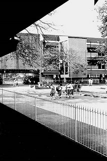 Difference in tone; diminishing details
Remember our discussion of tone? Well, photographs with a full tonal range from deep blacks to pure whites, with varying shades of gray, can convey depth better than photographs with low contrast.
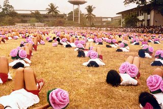 I took the picture above way, way back in 1986. Some of you may not have been born yet at that time! The red bloomers and pink flowers on the foreground look much deeper or saturated in color and more detailed than the bloomers and flowers in the background. The differences in the intensity of the colors and the diminishing details from the foreground to the background both help convey depth.
Selective or differential focusing
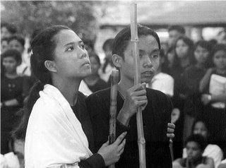 The picture above has a blurred background because of the shallow depth of field (we will discuss lens openings later on). Through the use of differential focusing or selective focusing, the student-actress and actor both seem “separated” from their backgrounds. The students seem to have been simply cut out with scissors and then pasted on the background. (Note: See the discussion below on rack focus.)
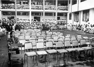
When one object appears larger than other objects which may be of the same size, the larger object is perceived by our minds as being closer. The teacher on the left corner of the picture above appears larger than the solitary guy in the middle who’s covering his head from the rain (can you pick him out?) and the students in the background. Notice also that the chairs are all the same size but those in the foreground look larger than those in the background. The contrast creates the sense of depth.
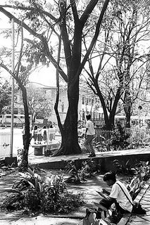 With the picture above, the student sitting on the foreground area appears larger than the boy walking past him, the female students in the background, and the statue framed by the tree in the middle. The student in the foreground is therefore perceived by our minds as being closer.
Atmospheric haze
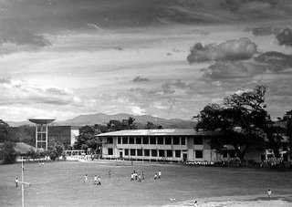
Remember our discussion on atmospheric haze? Distant subjects appear lighter in tone and less distinct in appearance than nearby subjects. One technique that professional photographers use is to provide so-called “distance cues” or “foreground interest.” With distance cues, you have to provide the viewer some guide to differentiate the foreground, middle ground and the background. (We will discuss later on what is known as false attachment.) These guides will provide not only the illusion of depth but also a sense of scale. With foreground interest, it is common to place persons (like the students playing in the athletic oval in picture above) or other objects in the foreground to provide depth and scale.
Sidelighting
Sidelighting (as in the picture below) creates depth by “separating” the subject from the background and by providing what photographers call “modeling” or a three dimensional effect.
 Overlapping objects or forms
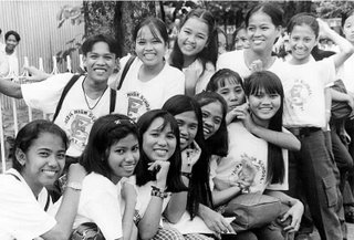
Our minds have been conditioned to think that objects hidden from view are farther away, while those which hide them from view are perceived as being nearer. When objects or forms (like the girls and cadets in the picture above) overlap one another, the sense of depth is thus created. Why? Because we can’t see through these objects. We don’t have X-ray vision like Superman, or that teenaged protagonist in National Artist Nick Joaquin’s short story “Candido’s Apocalypse” who acquires the ability to see through clothes, flesh and bones and the human spirit, in his quest for God.
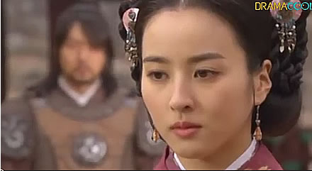
Rack focus (selective or differential focusing as used in cinematography)



No comments:
Post a Comment