Update as of September 18, 2023:
If you’re a high school or grade school student in the Philippines who’s joining the photojournalism contest in the division, regional, or national press conference, I’m offering two free resources to you :
A. 900-plus interactive exercises on English grammar, vocabulary, reading comprehension, verbal analogy, etc (with around 200 megabytes total file size). The exercises have time limit and automatic scoring, with an average of 10 items per exercise.
Examples of these interactive exercises are: Common English grammar errors: Exercise 01 (nouns - confusions of number); Phrasal Verbs: Expressions with Go; English Placement Test (45 items).
B. 200-plus resources (JPG, PDF, MP4, etc.) on photography and photojournalism, with 600-plus megabytes total file size. For some examples of these resources, surf to the “Free photography e-books, cheat sheets” page.
For the download links and more information about how to use the interactive exercises, please surf to my “Better English resources and exercises” blog. Please inform your journalism teacher/schoolpaper adviser or your parents about these resources before downloading them.
If you have any question about downloading or using these free resources, please email me (after informing your journalism teacher/schoolpaper adviser or your parents). I’ll be able to reply to you within two to three days; if you don’t see my reply in your Inbox, check your Spam folder. Or, you can text me.
Atty. Gerry T. Galacio
gtgalacio@yahoo.com
0927-798-3138
|
Element of form
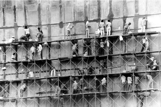
In the early days of photography, tribesmen from jungles and mountains believed that cameras had the power to steal their soul and imprison them in a piece of paper. But photographs really are just reproductions of what is actually there in reality. The problem oftentimes, however, is that a lot of pictures do not have depth, which makes them look unreal. Here we need the element of form. While shapes are two-dimensional, form provides a third dimension – depth. If you are mathematically oriented, think of it this way; shapes only have the x- and y-axis, while form has the x-, y-, and z-axis.

 The word photography actually comes from two words – “photon” meaning light and “graphein” meaning “to write.” As someone once said, without light, photography is not possible.
 And so it is with form and depth. When light strikes an object, it creates highlights and shadows. If I remember correctly my Humanities I subject in UP Diliman way back in 1973, the interplay of light and shadow is called “chiaroscuro.” The combination of highlights and shadows convey a sense of depth, of volume or of the subject’s solidity like the pictures above of the rubber doll nestling in the rusted milk cans, and the folds in the nuns’s uniforms.
Note: We will later on discuss the quality and direction of light; enough to say for now that in terms of the direction of light, sidelighting best emphasizes form.
Element of texture
 A child’s soft skin, a stuffed toy’s rough, furry exterior ... While form gives us an idea of what it would be like to hold the object in our photograph, texture gives us an idea how that object’s surface would be like to touch, whether it would be rough or smooth.
In picture above, my nephew JR poses together with his stuffed toy. He’s cute because he looks like me. Hold it! Let me get that straight. I don’t look like the stuffed toy; I look like JR, okay? okay? You can almost feel the softness of his skin and cheeks, and the furry exterior of that stuffed parrot.
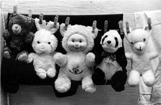 The stuffed toys in the picture above are obviously just enjoying themselves, hanging out together
 and, although, they’re in the shade, you can also sense their furry texture.
I’m sure the girls among you will agree with me that this picture is probably the cutest picture in the history of photography!
Photographs (with fast lenses and slow film; more on this later) can very accurately and realistically portray textures but this may not always be desirable. In portraits, for example, subjects often want to look years younger than they really are (
men!) or more beautiful than they really are (
women!).
Oftentimes, photographers have to use soft focus lenses or diffusion filters (and now, Adobe Photoshop and other software) to “alter the textural quality of the image” which is really a euphemism for removing or hiding the subject’s lines, wrinkles, blemishes, warts, etc. Why can’t people be like Oliver Cromwell, England’s protector who beheaded King Charles I? When he was asked by a portrait painter to turn his face sideways, he ordered, “Paint me, warts and all!”
In landscapes or nature photography, however, scenes sometimes look best when the texture of rock formations, trees, etc. stand out.
(By the way, Galen Rowell is known as America’s best scenic photographer. Did you know that before he became a photographer, he worked as an auto mechanic? Great career change!)
Be a better writer or editor through StyleWriter 4: this software checks 10,000 words in 12 seconds for hundreds of style and English usage issues like wordy and complex sentences, passive voice, nominalization, jargon, clichés, readability, spelling, etc.
StyleWriter 4 graphs your style and sentence variety, and identifies your writing habits to give an instant view of your writing. You can learn to adjust your writing style to suit your audience and task. You can learn, for example, the writing style of Newsweek, Time, The Economist, and Scientific American.
StyleWriter 4 is widely used in the US federal government (for example, the Environmental Protection Agency). It can be used by educators, students, and professionals in various fields - business, law, social or physical science, medicine, nursing, engineering, public relations, human resources, journalism, accounting, etc. Download your free 14-day trial copy now. |