Wednesday, August 29, 2007

Photojournalism (23): Techniques in composing your shots like Steelyard Principle (visual balance), linear perspective, contrast by tone or by focus, Dynamic Symmetry (hidden geometric patterns), Dutch angle, Golden Ratio or Fibonacci Spiral; know when to break the rules

Relevant materials:

“9 photo composition tips (feat. Steve McCurry)”


“50 Photography Composition Tips” by Erick Kim (video)


10 Ideas to Instantly Improve Your Photography Composition

5 Things That Will Instantly Improve Your Photography

Breaking down masterful composition of Henri Cartier-Bresson’s photos

How to use composition patterns to improve your travel and people photography

How to create a strong focal point and manage attention inside your photographs

Why Composition is So D–n Important

How I Saw the World Before and After I Became a Photographer

The Art of Composition: A Dynamic Symmetry User's Guide for the Modern Artist
(a series of personal analytical notes) free PDF
Index of topics discussed in this post: Photography and “A House Full of Memories”; Learning good photography from National Geographic magazines; Decide first what theme, emotion, idea or concept you want to convey; Think about the best way to shoot your subjects before actually doing so; Dynamic Symmetry: composition, geometry, and hidden patterns; Other ways of composing your shots: Steelyard Principle (visual balance); Place vertical elements against horizontal elements, or vice-versa; Contrast one object in sharp focus with another object that is out of focus; Using linear perspective; Balance by tone; Using the picture diagonal; Dutch angle or Dutch tilt; Golden Ratio or Fibonacci Spiral; Breaking the rules to get better photographs; Each subject presents unique possibilities; Ways to improve your composition skills

From your English and Filipino subjects, you will remember that your essays (or compositions) need a certain structure – the introduction, the body and the ending or conclusion. Everything has to fit together just right. As your language teachers would say, your composition needs unity or coherence.

If you hang around photographers (whether professionals or serious hobbyists), you will constantly hear the word “composition.” Just like with your essays, the elements of your photographs have to fit just right, with no extraneous details. With photography, you’re concerned with the best possible ways to come up with aesthetically pleasing images. “To the max,” as some of you might say.

We have already discussed some “rules” and “techniques” in photography, like the Rule of Thirds, the use of diagonal lines, quality and direction of light, etc. If you’re a beginning photographer, it’s good training for you to look at pictures in books and magazines taken by famous photographers, and analyzing them in terms of the rules or techniques.

Photography and “A House Full of Memories”

I remember way back in 1979, I saw an award-winning picture taken by Ed Santiago, who is considered as the dean of photojournalists in the Philippines. It was a picture of a row of the century old Spanish type houses in Vigan, Ilocos Sur. That picture (entitled “A House Full of Memories”) greatly encouraged me to learn photography. Looking back now, that award winning picture used diagonal lines, patterns and natural frames.

In one magazine interview, Ed Santiago said that he discouraged his children from taking up photography because of the low pay and the hardships involved. What happened? You guessed it right; all his children went into photography as their careers.

I had the privilege of meeting Ed Santiago during the 1993 National Secondary Schools Press Conference in Rizal High School in Pasig. I was helping out the NSSPC organizers led by Miss Elena Tanodra when to my surprise, Ed Santiago asked me to help him out by being one of the members of the panel of judges for the photojournalism competition. That was when I told him about “A House Full of Memories” and its impact on me.

Learning good photography from National Geographic magazines

One cheap way of learning how to shoot good pictures is to buy the old editions of National Geographic magazines, available in second hand bookstores. The photographers who work for this magazine are some of the best in the world, and you will learn a lot from looking and analyzing their pictures. One article I read said that photographers for National Geographic (before the advent of digital photography) were provided with several hundred rolls of film just for one assignment. Wow!

For beginning photographers, the tendency with having that many rolls of film is to shoot wildly, shooting anything that moves or anything that crosses our viewfinder, hoping that we will somehow produce a good picture. In one interview before he died in 1985, world famous Ansel Adams said that he came to a point in his career that he could expect to get only three good pictures for every roll of film he shot.

Having seen good photographs by good photographers and analyzing them in terms of the techniques used, you will become more discriminating in your choice of shots. You will be able to decide almost instantaneously what photographic techniques to use as the image or the event develops (no pun intended) before you.

What Makes a Great Picture? (National Geographic)


Making Simply Beautiful Photographs (National Geographic)


Decide first what theme, emotion, idea, or concept you want to convey

Paul Brand, considered as the world’s best documentary photographer, once said, “The world is full of picture makers who have nothing to say.” One good approach is to decide what theme, emotion, idea or concept you want to convey to your viewers. (Remember our discussion on learning how to see photographically?) After that, you can then choose only those elements or techniques that would help express such theme or idea. Ask yourself, “What do I want to say? What do I want this picture to express to the viewer? How do I want the viewer to react? ” The next things to ask are, “What elements do I emphasize or exclude, what techniques do I use to express this theme, this emotion?”

Composition; decide first what emotion, idea or mood you want to convey to your viewers; Rizal High School, 1991; photo by Atty. GalacioThe acacia trees in the picture above, I’m told, have been part of Rizal High School in Pasig since the early 1900’s. The school was established in 1902 by the “Thomasites,” the first group of American teachers who came to the Philippines after the US gained possession of the Philippines from the Spaniards. I remember studying under these trees when I was a high school student in the 1970’s. I remember being chased around these trees by a lot of pretty girls. Hey, what can I say? I owed a lot of people a lot of money in those youthful days!

Fast forward from the 1970’s to 1991. I was then working in my alma mater (which is Latin for “pure or chaste mother” if you care to know). I wanted a picture that would express the idea that these trees have been silent witnesses to the lives of thousands of students who have studied in this school over more than ninety years. (Rizal High School has been credited in the Guinness Book of World Records as the biggest school in the world with over 26,000 students. But as of schoolyear 2006-07, its enrollment went down to around 8,000. Reason is, a lot of the annexes have become independent high schools.) I wanted to express the idea that while some things may come and go, these trees will always be there.

I focused on the nearest tree, centering it on the viewfinder. I loved the interplay of the late afternoon sunlight and the shadows on the trees and the wall. I felt however that there was something missing from the picture, and so I waited. Then I saw two students walking behind me. I raised my camera, and when they were just a little beyond the shadows on the wall, I took the picture.

These students provide the photograph a sense of scale in that we can estimate the size of the acacia trees through them. They also provide a sense of action; notice that they’re walking together in perfect cadence. The acacia tree and the boys both cast their shadows on the wall, and these provided the photograph with the sense of permanence and change I wanted to express.

Think about the best way to shoot your subjects before actually doing so

Composition; 1996; photo by Atty. Galacio 
Composing your shots doesn’t mean that you have to spend four to five weeks agonizing over how best to shoot your subjects. It simply means thinking about how best to shoot your subjects before actually doing so. The picture above, for example. The students were standing up, so I had focused on them at normal eye level point of view. They suddenly dropped down to the ground, and I instinctively dropped down too, on one knee. But then I knew that from such a viewpoint, I would only be able to shoot the girls in front; they would fill up the viewfinder, hiding from view the students behind them. I immediately stood up and took this shot from a now high angle point of view. All these took place in a matter of seconds.

Dynamic Symmetry: composition, geometry, and hidden patterns


Composition; depth; foreground blur; natural frame; photo by Atty. Galacio

Remember our discussion on the Rule of Thirds? The ways by which you place the elements of your image in any of the four intersecting points can create a variety of looks for the final picture. If you want a balanced look for your picture, for example, you have to place the elements at diagonally opposite intersections, like in the picture above of the boy and girl on the grass (where the students are at the upper left hand corner and the out-of-focus foliage is at the opposite right hand corner of the photograph).

Composition; hidden geometric patterns in good pictures; photo by Atty. Galacio

Henri Cartier Bresson, considered as the father of photojournalism (he died two or three years ago), once said that in every good picture, there is a hidden geometric pattern. To form a triangle, for example, you can place certain elements of your image at or near any three of the intersecting points. For example, can you see the triangle in the picture above? The student who’s lying prostrate on the ground at the lower left hand and the bottle form the base of the triangle, with the apex being the head of the student in the middle, background area of the picture.

Okay now, what geometric patterns can be seen in the pictures below? Come on now, guys, don’t disappoint your Lolo Henri!

Composition; hidden geometric patterns in good pictures; photo by Atty. Galacio
Composition; photo by Atty. Galacio

Classically-trained painters often look down on the Rule of Thirds because it uses only horizontal and vertical lines and excludes diagonal lines. Instead, these painters use what is called “dynamic symmetry,” “armature of the 1.5 rectangle,” or “hidden geometry of painters.” As you can watch from the two videos below featuring the photographs of Henri Cartier Bresson, dynamic symmetry can be used in photography.

For more information about Dynamic Symmetry, surf to the website “Dynamic Symmetry Art” (topics include “What is Dynamic Symmetry?” and “Dynamic Symmetry for Photographers.”) You can also download the free PDF “The Art of Composition: A Dynamic Symmetry User's Guide for the Modern Artist” (446 pages).

Dynamic Symmetry, Composition and Henri Cartier Bresson - Part 1 of 2


Dynamic Symmetry, Composition and Henri Cartier Bresson - Part 2 of 2


Dynamic Symmetry: Adding Lines to Fit Your Needs [Composition Tips] (2018) by Tavis Leaf Glover


Other ways of composing your shots

Besides placing your subject in the dead center of your picture, following the Rule of Thirds, and looking for hidden geometric patterns, there are several other ways of composing the various elements of your subject into an aesthetically pleasing image.
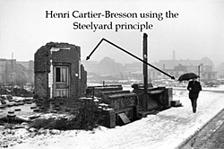
1. Steelyard Principle (From “The Art of Composition: A Dynamic Symmetry User’s Guide for the Modern Artist” v.5.8): “When the subject of a picture is on one side of the middle, it must be close to a pivot point. If it departs from the center, it must be balanced by a small weight element on the other side to create a visual balance.”

“In every composition, the eye will be first drawn to a central point of interest, which may be on one side of the image, then proceed to scan the opposite side looking for another element to receive it. If there isn't any object on the other end, it will give the viewer a feeling of imbalance. Artists that use the Rule of Thirds grid for composition should take note of the steelyard principle because the Rule of Thirds pulls the subject away from the center and off to one side. For this reason, it's easy to create imbalances in a picture.”

Visual balance

Composition by balancing various elements in the picture; photo by Atty. Galacio
In the picture above, the building is my main subject while the three girls on the lower right hand corner serve to balance things out. Without them, the photograph would look terribly out of balance; the left hand side would appear much heavier than the right hand side. While looking at the building through the viewfinder, out of the corner of my eye, I saw these three girls walking towards me. When they were just in the right spot, I took the picture.

(Please notice that the building appears to be falling off towards the background. This is known as the “keystoning effect.” The reason for this is that the film plane and the subject plane are not parallel. More on this later, I promise.)

Balance by tone

Composition; balance by tones or colors; photo by Atty. Galacio
Remember our discussion of tone? In the picture above, I composed the shot by balancing the image, with the girls in black on the left side of the frame balanced by the solitary guy in white on the right hand side.

2. Place vertical elements against horizontal elements, or vice-versa

Composition; balance of horizontals and verticals; 1992; photo by Atty. GalacioWith the picture above, my yearbook staffer makes friends with the statue of Amang Rodriguez. Here, I composed the shot by placing vertical shapes (my student and the statue) against a background made up of horizontal lines.

3. Contrast one object in sharp focus with another object that is out of focus

Composition; balance by one element in focus and another out of focus; photo by Atty. GalacioSpeaking of contrast, you can also compose your shot by placing together one object sharply in focus and another that is out of focus (in the picture above, the bottle in the foreground is in focus while the students in the background are slightly out of focus).

4. Using linear perspective

Composition; photo by Atty. Galacio
Composition; photo by Atty. Galacio Remember our discussion of linear perspective? You can compose your shots keeping in mind the effect of linear perspective, that is, elements located at different positions relative to the camera will be recorded as being of different sizes, although they may actually be of the same size.

In the first picture above, for example, the girl with the pig tails in the foreground is actually the smallest among the performers, but because of her position, she seems to be the tallest. In the second picture, the students at the foreground, meditating on the roof of a three story building, seem to dwarf the other students (in the middle of the frame) who are farther away from the camera.

5. Using the picture diagonal (Baroque diagonal and sinister diagonal)


Composition; picture diagonal; photo by Atty. GalacioAnother way of composing your shots is to place the most important elements of your image along the “picture diagonal,” as in the picture above. If you draw mentally a diagonal line stretching from the lower right hand corner up to the upper right hand corner, you will notice that the guy’s left hand, his body and face and his right hand all fall along the diagonal line. (In Dynamic Symmetry, this is called the “sinister diagonal.”

Composition; picture diagonal; my cute nephew JR; photo by Atty. GalacioThe picture diagonal can also be placed from the lower left hand corner stretching up to the upper right hand corner (in Dynamic Symmetry, this is called the “baroque diagonal,” similar to the picture above of my cute nephew JR who looks like me. Hey, what can I say? Cuteness is in our genes!

Dutch angle or Dutch tilt

From Wikipedia: The Dutch angle, also known as Dutch tilt, canted angle, or oblique angle, is a type of camera shot where the camera is set at an angle on its roll axis so that the shot is composed with vertical lines at an angle to the side of the frame, or so that the horizon line of the shot is not parallel with the bottom of the camera frame. This produces a viewpoint akin to tilting one's head to the side.

In cinematography, the Dutch angle is one of many cinematic techniques often used to portray psychological uneasiness or tension in the subject being filmed.

Dutch angles are frequently used by film directors who have a background in the visual arts, such as Tim Burton (in Edward Scissorhands and Ed Wood), and Terry Gilliam (in Brazil, The Fisher King, 12 Monkeys, Fear and Loathing in Las Vegas and Tideland) to represent madness, disorientation, or drug psychosis. In his Evil Dead trilogy, Sam Raimi used Dutch angles to show that a character had become possessed.


Golden Ratio or Fibonacci Spiral

The Golden Ratio vs. The Rule of Thirds


Top 10 Composition Tips - Photography Course Pt 3


The Golden Ratio Vs. The Rule of Thirds | The Initiative Pro


Breaking the rules to get better photographs

Following the techniques of composition in shooting your subjects generally yields good photographs. But these are not meant to be straitjackets to stifle your creativity. Never be afraid of breaking the rules when doing so would create “better” pictures. Always be aware of the possibilities that the subject presents to you, and never be afraid to explore all the creative potentials.

I don’t know if you have ever seen martial arts superstar Bruce Lee’s final movie, “The Game of Death.” He was able to shoot only the last 15 minutes of the movie before he died. The climax occurs in a pagoda where he meets several opponents coming from different martial arts styles. He first meets a Hapkido master, then a weapons expert played by Filipino Dan Inosanto, and finally he meets NBA legend Kareem Abdul Jabbar who represented the “Unknown Style” of fighting. In each encounter, Bruce Lee had to forget his set training and adapt his fighting techniques to the situation he found himself up against.

Each subject presents unique possibilities

The same thing may be said of photography. Don’t be bound by a “style” which you may have been taught or trained in. Each subject presents unique possibilities. Let the subject itself decide how you’re going to shoot it! Let’s say you have always used a telephoto lens; maybe the subject you’re shooting now calls for a wide angle lens. Maybe, you’ve always liked blurred backgrounds but your subject right now would be better with foreground blur ...

For example, Annie Leibovitz is the best portrait and editorial photographer in the world, ranking number 2 in American Photo’s 1996 survey of the 100 most important people in photography. Did you know she once asked Olympic hero Carl Lewis to wear high heels for a photo project? She had always worked in the studio with several assistants, and with lots of lights, reflectors and other equipment. In 1993, however, she went alone to Sarajevo, Bosnia Herzegovina which was then experiencing a civil war along ethnic, religious and political lines. She shot ordinary men and women using only available light.

(Using camera flash in a war zone is extremely dangerous. If you and your subjects are in hiding, using the flash could give away your position. Worse, the flash of light could be mistaken as coming from the muzzle of a gun, and that could unwittingly invite retaliatory gunfire from the combatants. We will discuss using the camera flash later on. In the meantime, try to find a DVD of the movie “Flowers for Harrison.” It’s a powerful, gut wrenching, for adults only, movie about photographers in the midst of the Bosnian civil war.)

Ways to improve your composition skills

1. Practice picture composition by looking at your subjects through the viewfinder, without actually shooting.

2. Look at your subjects through the viewfinder and shoot them, without any film on your camera. If you’re using a digital camera, then it’s okay to shoot your subjects. You can simply erase your files later on.

3. Do it in the mind’s eye; with only your eyes, your imagination, visualize how your subject would look on film, in print, or in the computer screen (that is, if you’re into digital photography and placing your pictures on the Internet).

4. Do it the way movie directors sometimes do. Use both hands to frame your subject and to visualize how your subject will look on film, print or the computer screen. But don’t do this while you’re in the mall, okay?

Be a better writer or editor through StyleWriter 4: this software checks 10,000 words in 12 seconds for hundreds of style and English usage issues like wordy and complex sentences, passive voice, nominalization, jargon, clichés, readability, spelling, etc.

StyleWriter 4 graphs your style and sentence variety, and identifies your writing habits to give an instant view of your writing. You can learn to adjust your writing style to suit your audience and task. You can learn, for example, the writing style of Newsweek, Time, The Economist, and Scientific American.

StyleWriter 4 is widely used in the US federal government (for example, the Environmental Protection Agency). It can be used by educators, students, and professionals in various fields - business, law, social or physical science, medicine, nursing, engineering, public relations, human resources, journalism, accounting, etc. Download your free 14-day trial copy now.

Sunday, August 26, 2007

Photojournalism (22): Techniques for creating depth in your pictures

Free articles and cheat sheets from Digital Camera World:

3 camera lessons every new photographer should learn

A layman’s guide to depth of field; how to check and affect sharpness like a pro

How aperture affects depth of field
 
Aperture: when to go small and when to go wide
Jughead is that lazy but lovable character in the cartoon strip “Archie.” One time, to impress other people, he suddenly takes up painting. Reggie passes by and Jughead asks him, “I want to give this painting more depth! Any suggestions?” Reggie, turned off by Jughead’s pretentiousness replies, “Yeah, throw your painting into the ocean!”

As we have discussed before, a photograph is two-dimensional, with width and height but no depth. Oftentimes, when we look at our pictures, they look so disappointingly different from what we saw with our eyes. The primary reason for this is that we have failed to adequately and deliberately play up the illusion of depth in our pictures.


Remember that our eyes and the camera see things differently. As Galen Rowell once said in an interview, “film is a foreign language.” ( Rowell is a self-taught photographer now considered as America’s foremost scenic photographer and writer.) What he’s saying is that we’ve got to learn the nuances of film, of photography, in order to come up with better photographs. Incidentally, Rowell was an auto-mechanic before he took up photography. Great career change, huh?

Ways to create depth in photographs

Besides throwing your pictures into the ocean, there are several other ways to create and more adequately convey the illusion of depth in your pictures. These are:
  1. converging lines
  2. selective or differential focusing
  3. sidelighting or backlighting
  4. atmospheric haze
  5. contrast of same-sized objects
  6. natural frames
  7. overlapping objects or forms
  8. diminishing detail
  9. the difference in the intensity of tones or colors
Converging lines

In the picture below, I used natural frames, converging lines and difference in tones to convey depth.
I used the roof of the open canteen where I was and the ground to frame the building which was my main subject. Since I took my exposure from the flagpole area, the roof and the ground were recorded totally black (while the rest of the image shows various shades of gray. From my oblique point of view, the edge of the roof, the ground and the iron fence seem to be converging towards the vanishing point at the left side of the picture.

Conveying depth through diagonal lines, difference in intensity of tones, natural frame; Rizal Hall 1992; photo by Atty. GalacioDifference in tone; diminishing details

Remember our discussion of tone? Well, photographs with a full tonal range from deep blacks to pure whites, with varying shades of gray, can convey depth better than photographs with low contrast.

Conveying depth through diminishing details; Rizal High School 1986 Field Demo; photo by Atty. GalacioI took the picture above way, way back in 1986. Some of you may not have been born yet at that time! The red bloomers and pink flowers on the foreground look much deeper or saturated in color and more detailed than the bloomers and flowers in the background. The differences in the intensity of the colors and the diminishing details from the foreground to the background both help convey depth.

Selective or differential focusing


Conveying depth through a blurred background; photo by Atty. GalacioThe picture above has a blurred background because of the shallow depth of field (we will discuss lens openings later on). Through the use of differential focusing or selective focusing, the student-actress and actor both seem “separated” from their backgrounds. The students seem to have been simply cut out with scissors and then pasted on the background. (Note: See the discussion below on rack focus.)

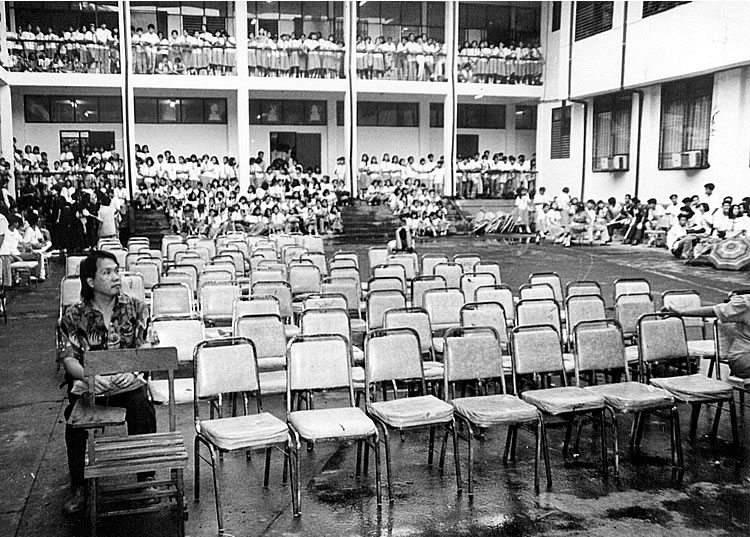
Conveying depth through contrast of same-sized objects; Rizal High School main Building 1993; photo by Atty. Galacio 
When one object appears larger than other objects which may be of the same size, the larger object is perceived by our minds as being closer. The teacher on the left corner of the picture above appears larger than the solitary guy in the middle who’s covering his head from the rain (can you pick him out?) and the students in the background. Notice also that the chairs are all the same size but those in the foreground look larger than those in the background. The contrast creates the sense of depth.

Conveying depth; photo by Atty. GalacioWith the picture above, the student sitting on the foreground area appears larger than the boy walking past him, the female students in the background, and the statue framed by the tree in the middle. The student in the foreground is therefore perceived by our minds as being closer.

Atmospheric haze

Remember our discussion on atmospheric haze? Distant subjects appear lighter in tone and less distinct in appearance than nearby subjects. One technique that professional photographers use is to provide so-called “distance cues” or “foreground interest.” With distance cues, you have to provide the viewer some guide to differentiate the foreground, middle ground and the background. (We will discuss later on what is known as false attachment.) These guides will provide not only the illusion of depth but also a sense of scale. With foreground interest, it is common to place persons (like the students playing in the athletic oval in picture above) or other objects in the foreground to provide depth and scale.

Conveying depth through foreground elements and difference in intensity of tones; Rizal High School 1995; photo by Atty. Galacio
Sidelighting

Sidelighting (as in the picture below) creates depth by “separating” the subject from the background and by providing what photographers call “modeling” or a three dimensional effect.

Conveying depth through sidelighting; 1991; photo by Atty. GalacioOverlapping objects or forms

Our minds have been conditioned to think that objects hidden from view are farther away, while those which hide them from view are perceived as being nearer. When objects or forms (like the girls and cadets in the picture above) overlap one another, the sense of depth is thus created. Why? Because we can’t see through these objects. We don’t have X-ray vision like Superman, or that teenaged protagonist in National Artist Nick Joaquin’s short story “Candido’s Apocalypse” who acquires the ability to see through clothes, flesh and bones and the human spirit, in his quest for God.

Conveying depth through overlapping objects; photo by Atty. Galacio

Rack focus (selective or differential focusing as used in cinematography)


Wednesday, August 22, 2007

Photojournalism (21): Natural frames

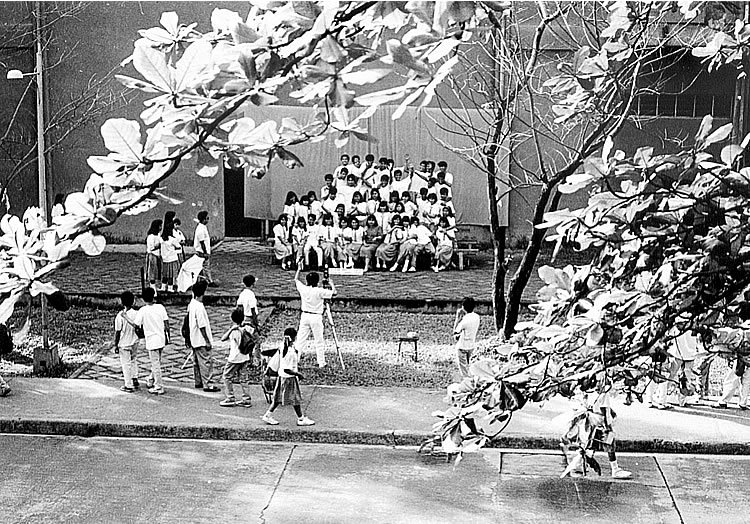
Natural frames; Rizal High School 1992; photo by Atty. Galacio
Natural frames; Rizal High School Field Demo 1996 practice; photo by Atty. GalacioNatural frames, as the term suggests, are those found in nature, in your surroundings like windows, doorways, arches, trees, a fence, etc. and which can be effectively used to emphasize or to isolate your subject. If you want to make better photographs almost instantaneously, you should make use of natural frames.

In the first picture above, for example, the scene (a high school class having their group picture taken) is framed by the branches of a tree. I was on the 2nd floor of a building overlooking the scene and I purposely placed that class within the frame created by the branches.

In the second picture above, I had been shooting lots of pictures of the practices for the field demonstration at ground level. I wanted to shoot from a higher point of view, so I went up to the 2nd floor of a nearby building. I got a good view of the practices and was able to use the branch of an acacia tree to frame the scene. If I didn’t use the branch as a natural frame and just focused on the practicing students, I would have had empty spaces on the upper and left side of the image. Plus, the branch (extending from the left to right hand side of the image) complements the outstretched hands of the students.

Kinds of natural frames

Natural frames can be:

  • full or partial
  • in sharp focus or out of focus
  • local (made up of objects which are part of your subject)
  • composite (a frame within a frame)
  • running along the top or bottom of the picture, or along the sides
  • in the foreground or in the background.
Besides objects found in nature, frames can also be made of shadows, reflections, swatches of colors, shapes and forms, etc.

Natural frame, decisive moment; Rizal High School 1993; photo by Atty. GalacioSome very handy natural frames are doors and windows, as shown by the picture of the students above.

Natural frames – partial and out of focus; photo by Atty. GalacioIn the picture above, my primary natural frame is the partial, slightly out of focus santol tree on the left hand side at the foreground. The post and the windows behind the student also serve as natural frames. A natural frame may either be in the foreground or in the background.

Natural frames; My cute nephew Gino who looks like me; Hey, what can I say? Cuteness is in our genes! Photo by Atty. GalacioIn the picture above, I used the fluffy dolls to frame my cute nephew Gino (who looks like me!) and to complement the image of a one year old child just learning how to crawl.

The walkabout

How do you come up with good, creative natural frames? By carefully choosing your viewpoint; don’t just point your camera at your subject and shoot at once. Good photographers do the “walkabout” which simply means moving around your subject and looking for objects which can be used as natural frames. In the next three pictures below, for example, I shot the water tank (a famous landmark in Rizal High School in Pasig) at various times, from various angles, and using different natural frames.

Partial, natural frame; Rizal High School 1991; photo by Atty. Galacio
Natural frame; silhouette; photo by Atty. Galacio
Natural frame, silhouette; photo by Atty. GalacioI even got a picture of this water tank as a reflection, as in the picture below. But this time around, it is the reflection that serves as a natural frame for the student. (In a future posting, we will discuss reflections as a photographic subject.)

Natural frame, reflection; Rizal High School 1991; photo by Atty. Galacio

9 Photo Composition Tips (featuring Steve McCurry, 2002 Photographer of the Year, American Photo Magazine); Tip No. 4: Natural frames

Saturday, August 18, 2007

Photojournalism (20): Foreground blur, background blur, bokeh; keep your background simple and uncluttered; false attachment; foreground interest; rack focus

Kiss! Nope, this isn’t an order to grab your partner and start smooching. “Kiss” is an abbreviation for a rather blunt advice for all photographers to “Keep it simple, stupid!” This means giving emphasis to your main subject by excluding all other distracting details from the photograph.

Background must not be cluttered with distracting details

Avoid a cluttered background; photo by Atty. GalacioThe background mustn’t be cluttered with distractions that compete with the subject for the viewer’s attention (like the spectators and other participants waiting for their turn in the picture above).

Background blur

Besides looking for the best viewpoint, you can also make use of “background blur” to erase distracting details. By using a big lens opening like f/1.8, f/2, f/2.8 or f/4 (more on this later), you can create a blurred background like in the pictures below.


Out of focus background makes your subject pop out of the background; photo by Atty. Galacio

Background blur helps focus attention on your subject; photo by Atty. GalacioForeground blur

In the same way, you can also create what is known as “foreground blur” as in the picture below.


Foreground blur; photo by Atty. Galacio

Bokeh

“Bokeh—from the Japanese ‘boke’, meaning ‘blur’ or ‘haze’—is the blurring or more precisely the aesthetic quality of the blurring of a photograph. Blurring is achieved by using a shallow depth of field. It can be used to create a number of striking light effects or simply to highlight a subject by keeping the rest of an image out of focus.” (From “Bokeh: Using Blur To Your Advantage” by Luke Clum)

Resources on bokeh:

1. How to Obtain Maximum Bokeh; 2. Bokeh for beginners from Nikon USA; 3. Creating Artificial Bokeh in Your Own Home; 4. Beautiful Examples of Bokeh Photography by James Adam; 5. “How To Create Beautiful Bokeh Images”; 6. (More) Beautiful And Captivating Examples of Bokeh Photography by Taimur Asghar

“Bokeh Basics: Take and Make Great Photography with Gavin Hoey”


“Beyond Basic Bokeh: Take and Make Great Photography with Gavin Hoey”


False attachment

The subject of your photographs can be located in the foreground, middle ground, or in the background. But notice the pictures below. That’s right, there’s no middle ground, only the foreground and the background.


The foreground elements are the chairs (first picture above), and the students performing in the Field Demonstration (second picture). In both pictures, I used a very small aperture (f/16), and a telephoto lens. In the first picture above, the chairs and students on the stage, AND the students in the first row and the building in the background, seem to be attached to one another, or located in just a single plane. (Later on, we will discuss compressed or stacked perspectives, telephoto lenses, etc.)

In reality however, the chairs (first picture) and the students (second picture) were separated from their backgrounds by a distance of nearly 200 feet. If I had used a more frontal viewpoint in both pictures, the effect would have been more pronounced. This illusion is called “false attachment” and is used in those “gimmicky” pictures where somebody seems to be holding in his or her palm another person, or seems to be swallowing that person.

Rack focus (foreground and background blur as used in cinematography)


Foreground interest


Image Magnification and Foreground Interest

Monday, August 13, 2007

Photojournalism (19): Rule of Thirds explained; the Rule of Thirds versus the Golden Ratio or Fibonacci Spiral; Dynamic Symmetry (hidden geometry of painters) as alternative to Rule of Thirds

Update as of September 18, 2023:

If you’re a high school or grade school student in the Philippines who’s joining the photojournalism contest in the division, regional, or national press conference, I’m offering two free resources to you :

A. 900-plus interactive exercises on English grammar, vocabulary, reading comprehension, verbal analogy, etc (with around 200 megabytes total file size). The exercises have time limit and automatic scoring, with an average of 10 items per exercise.

Examples of these interactive exercises are: Common English grammar errors: Exercise 01 (nouns - confusions of number); Phrasal Verbs: Expressions with Go; English Placement Test (45 items).

B. 200-plus resources (JPG, PDF, MP4, etc.) on photography and photojournalism, with 600-plus megabytes total file size. For some examples of these resources, surf to the “Free photography e-books, cheat sheets” page.

For the download links and more information about how to use the interactive exercises, please surf to my “Better English resources and exercises” blog. Please inform your journalism teacher/schoolpaper adviser or your parents about these resources before downloading them.

If you have any question about downloading or using these free resources, please email me (after informing your journalism teacher/schoolpaper adviser or your parents). I’ll be able to reply to you within two to three days; if you don’t see my reply in your Inbox, check your Spam folder. Or, you can text me.

Also, if you win in the photojournalism contest at whatever level (district, division, regional, or national), you can send me your prizewinning pictures, and I will feature them in a blog post.

Atty. Gerry T. Galacio
gtgalacio@yahoo.com
0927-798-3138


Note: At the bottom portion of this post, you can watch YouTube videos explaining (1) the Rule of Thirds; (2) the Rule of Thirds versus the Golden Ratio or Fibonacci Spiral; and (3) Dynamic Symmetry (hidden geometry of painters) as an alternative to the Rule of Thirds.

We have been taught from our earliest picture-taking days to center the subject in the viewfinder, with other elements or details placed equally on the left and right sides of the subject.With the picture below for example, my cute niece Chloe and my cute nephew Gino (who looks like me!) are in the center of the frame, with their fluffy dolls on their left and right sides.

My niece Chloe and my cute nephew Gino (who looks like me); balanced or symmetrical view; photo by Atty. Galacio

(If you are using a 35-mm compact camera, what usually happens is that your subject turns out either on the left or the right side of the picture when you thought you had centered your subject while viewing it through the viewfinder. This is called “parallax error.” With a single lens reflex camera, you don’t have to worry about “parallax error” since what you’ll see through the viewfinder is exactly what the camera lens sees. With the advent of digital cameras where you can see your subject on a LCD panel, parallax error isn’t much of a problem anymore.)

Photography is a relatively young art, having existed for only more than 167 years, compared with painting which has been practiced since the dawn of history. Some people think that painters are better than photographers, or that photography is an art form that’s second class compared to painting. Nothing can be further from the truth. World renowned painters like Miró, Picasso, and Monét were all avid photographers. Toch Arellano, a well-known Filipino photographer who specializes in portraits and yearbook photography, was taking up painting in UST, if I remember right, before he shifted to photography. Vic Sison, a multi-talented Filipino artist, incorporates paintings into his photographs.

Rule of thirds: giving your subject off-center emphasis


If you’d like therefore to excel in photography, you should learn from the techniques of painters. (Portrait photographers oftentimes talk about “Rembrandt lighting.”) One such technique is the so-called “Rule of Thirds.” Following this rule gives your subject or some important element of your image off-center emphasis. You can do this by dividing a scene into a one third/two thirds proportion.

Here’s how:

Step 1
: Divide the picture area into three equal parts, both horizontally and vertically. The dividing lines will create four intersecting points, which are called the intersection of thirds.

Step 2: Place your subject (or some important element of your image) at or near any of the intersections.


Take these students in the picture above. I could have centered them in the viewfinder and I would certainly have come up with a good picture. But I purposely placed them at the intersection of thirds to give them off-center emphasis. Placing them at the intersection of thirds gave more emphasis to the boy’s outstretched left hand pointing toward the distance.

Rule of thirds; place important elements of your image at the intersection of thirds; Rizal High School gym 1992; photo by Atty. GalacioIn the picture above of a gymnasium all decorated up for graduation ceremonies, I placed the bright roof light at the intersection of thirds (on the upper right hand corner) to give it off-center emphasis.

Rule of thirds; place your subject at the upper or lower one third of your image area; photo by Atty. Galacio

Rule of thirds; place your subject at the lower or upper one third area of your image area; NSSPC 1993 Rizal High School; photo by Atty. Galacio

The pictures above show another application of the Rule of Thirds. The boys, in the first picture, are on the upper one third of the frame. The stage (second picture) is at the lower one third of the picture while the trees occupy the upper two thirds.

This is exactly how you should shoot the sun. Don’t place the sun in the middle of the frame. Place it either at the upper one third or the lower one third area of the frame.


Golden Ratio or Fibonacci Spiral

Read (1) Why The Golden Ratio Is Better Than The Rule Of Thirds - PetaPixel and (2) Divine Composition With Fibonacci’s Ratio (The Rule of Thirds on Steroids).

The Golden Ratio vs. The Rule of Thirds


Top 10 Composition Tips - Photography Course Pt 3


The Golden Ratio Vs. The Rule of Thirds | The Initiative Pro


Dynamic Symmetry (hidden geometry of painters) as an alternative to the Rule of Thirds

Classically-trained painters often look down on the Rule of Thirds because it uses only horizontal and vertical lines and excludes diagonal lines. Instead, these painters use what is called “dynamic symmetry,” “armature of the 1.5 rectangle,” or “hidden geometry of painters.” As you can watch from the two videos below featuring the photographs of Henri Cartier Bresson, dynamic symmetry can be used in photography. (Bresson is known as the “father of photojournalism.”)

For more information about Dynamic Symmetry, surf to the website “Dynamic Symmetry Art” (topics include “What is Dynamic Symmetry?” and “Dynamic Symmetry for Photographers.”) You can also download the free PDF “The Art of Composition: A Dynamic Symmetry User's Guide for the Modern Artist” (446 pages).

Dynamic Symmetry, Composition and Henri Cartier Bresson - Part 1 of 2


Dynamic Symmetry, Composition and Henri Cartier Bresson - Part 2 of 2


Dynamic Symmetry: Adding Lines to Fit Your Needs [Composition Tips] (2018) by Tavis Leaf Glover


Be a better writer or editor through StyleWriter 4: this software checks 10,000 words in 12 seconds for hundreds of style and English usage issues like wordy and complex sentences, passive voice, nominalization, jargon, clichés, readability, spelling, etc.

StyleWriter 4 graphs your style and sentence variety, and identifies your writing habits to give an instant view of your writing. You can learn to adjust your writing style to suit your audience and task. You can learn, for example, the writing style of Newsweek, Time, The Economist, and Scientific American.

StyleWriter 4 is widely used in the US federal government (for example, the Environmental Protection Agency). It can be used by educators, students, and professionals in various fields - business, law, social or physical science, medicine, nursing, engineering, public relations, human resources, journalism, accounting, etc. Download your free 14-day trial copy now.